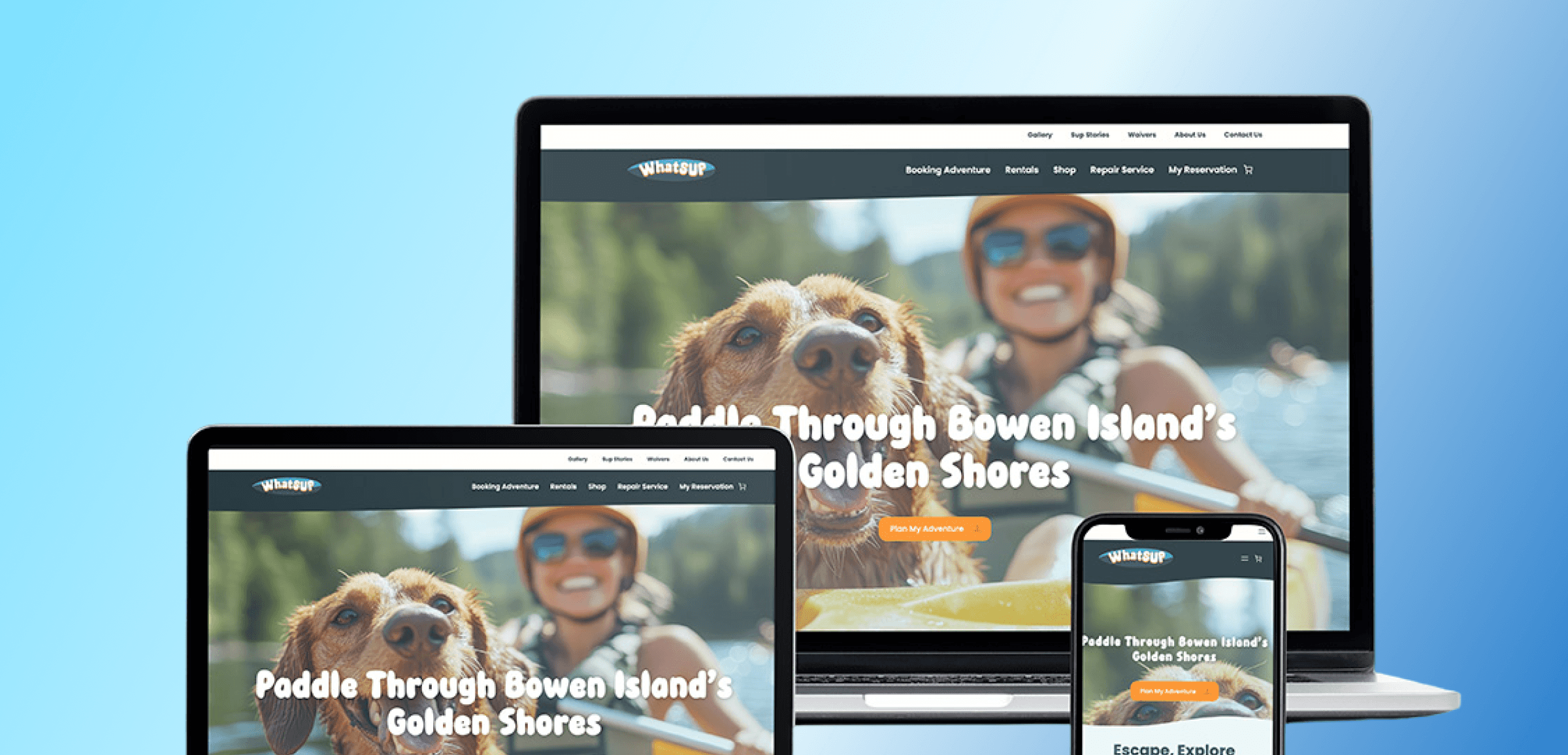
WhatSUP
A tourism website built to make every adventure easier to begin.
Redesigning a booking experience so simple,
it gets out of the way.
Adventure starts with a booking.
A WordPress-based outdoor rental and booking platform for paddleboarding, kayaking, lessons, and tours on Bowen Island.
Confusion kills the adventure before it starts.
Hidden fees and unclear steps were stopping people from completing bookings.
Structure first, friction last.
Reorganized IA around user intent and simplified the booking flow.
Confidence to book, Reason to return.
Users felt confident booking — and intended to come back.
People plan paddleboarding and kayaking trips to relax and spend time with people they care about.
Booking should be the easy part.
A booking process that took longer to figure out than the trip itself.
Pricing that only became clear at the very last step — after time was already invested.
Confusing enough that many gave up before they even started. Not just lost revenue — lost experiences.
This made us ask
what would it take for planning an adventure to feel as easy as the adventure itself?
78% of users prefer to book online. But preference doesn't mean completion — when the process feels confusing or untrustworthy, people abandon it, even for trips they were genuinely excited about.
94% of users rely on visuals and social proof to make decisions. The existing site had neither in the right places. Hidden fees, unclear categories, and poor navigation made trust hard to build.
A cleaner, more transparent booking flow could turn hesitation into confidence — and first-time visitors into repeat customers.
There was no existing WhatSup platform to audit — the project started from a brief, not a broken product. The real challenge was understanding what makes a booking experience trustworthy before any of it existed.
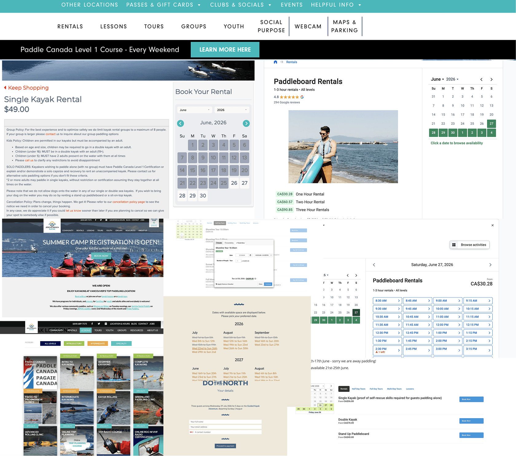
Competitive analysis
Five outdoor recreation booking platforms were analyzed to understand what worked — and what a strong booking experience needed to include from day one.
Clear category separation
Strong competitors filtered by skill level and activity type. Without that structure, rentals, lessons, and tours would blur together and confuse first-time users.
Trust signals up front
Reviews and guides appeared early on competitor sites — not buried. Trust had to be visible before a user committed to booking.
Seasonal strategy
Competitors designed for both summer and winter. A booking flow that only worked for peak season would lose half the year's potential visitors.
Clear calls-to-action
Strong competitors placed booking prompts right below the nav. Burying the path to booking, even by a few steps, would cost conversions.
These four patterns became the basis for every decision in the redesign.
Built the IA around clear categories from the start — separating rentals, lessons, tours, and group bookings so users could self-identify their path immediately.
Placed reviews, photos, and social proof high in the flow — visible before a booking decision, not after.
Structured content and navigation to support summer and winter use cases equally, instead of defaulting to peak-season assumptions.
Positioned clear calls-to-action close to the navigation on every page, so the path to booking was never more than a click away.
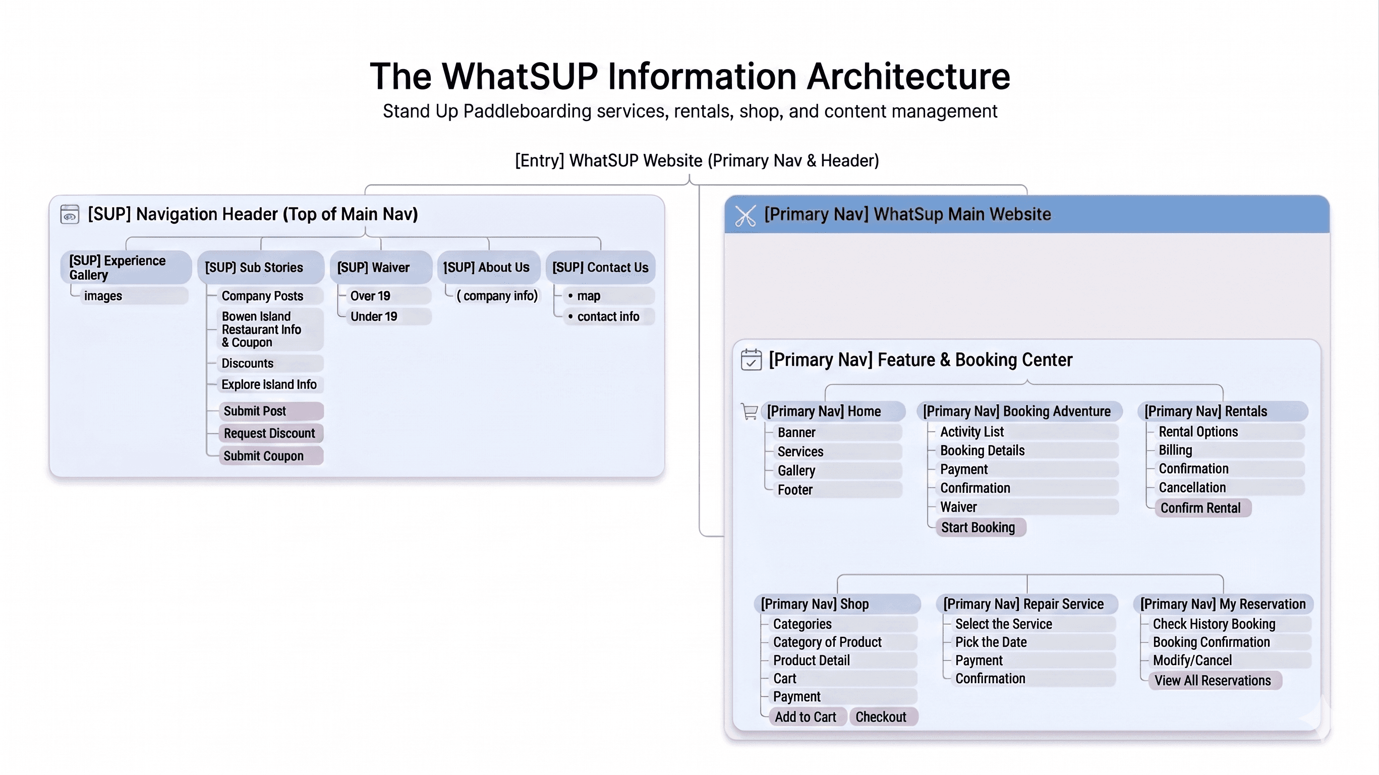
Information Architecture
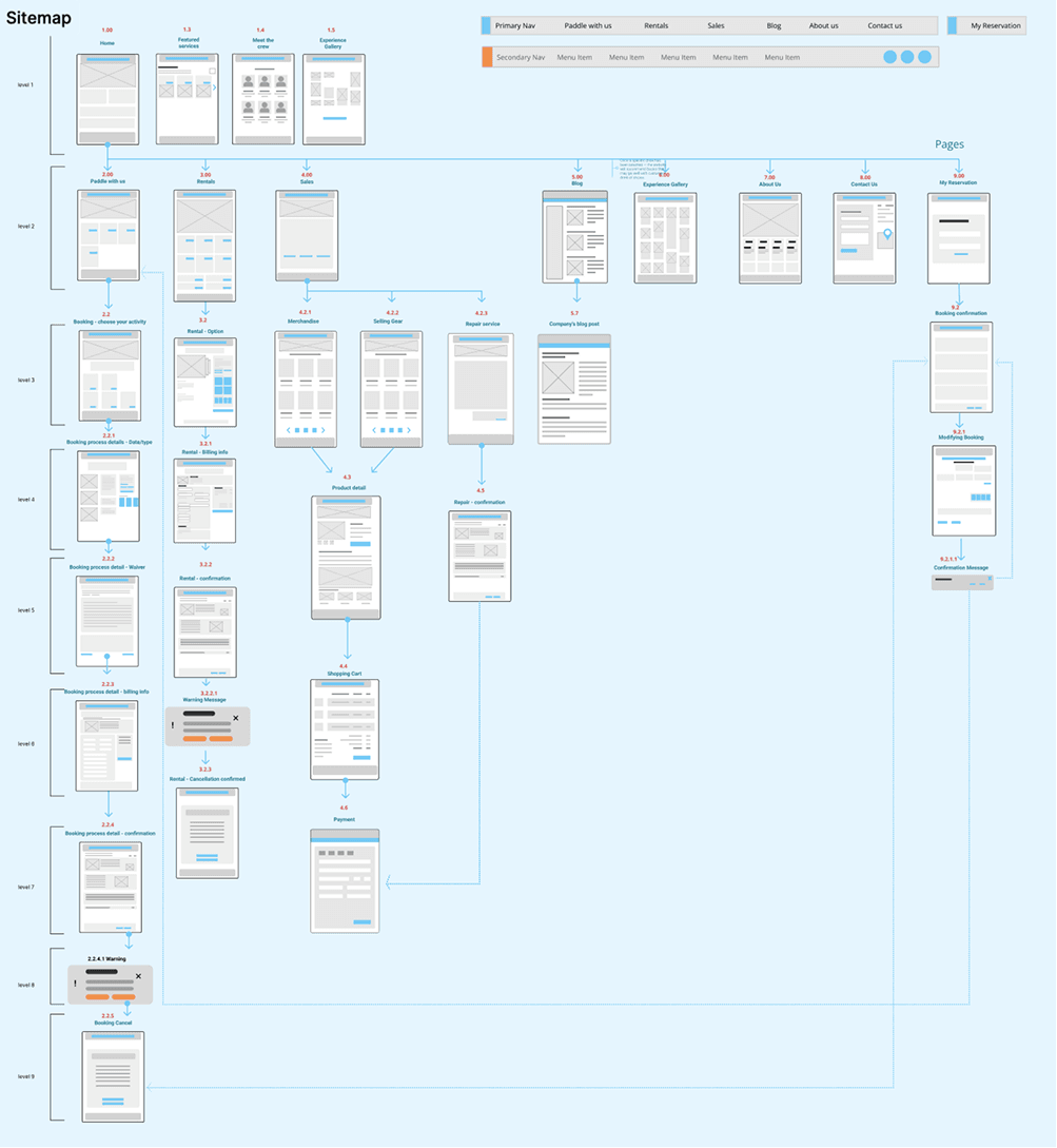
Site Map
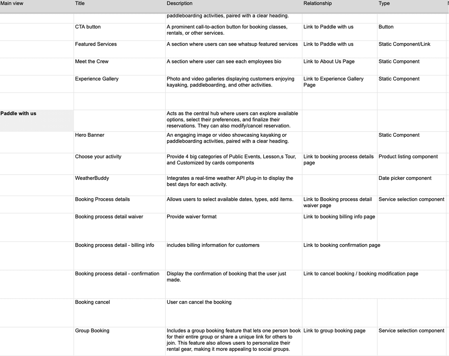
Content Inventory
Low-fi wireframes to test structure before committing to visual design.
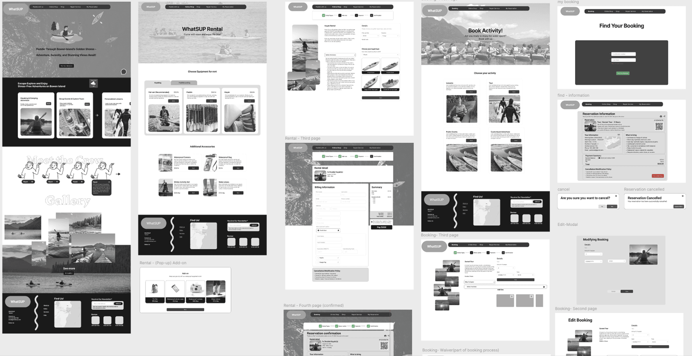
Testing navigation structure and information hierarchy before visual refinement.
Before User Testing
Navigation didn't match user intent, rentals and tours blurred together, the booking flow felt cluttered, and waivers surfaced too late — creating friction at every step.
After User Testing
Navigation was reorganized around intent, activities were clearly categorized, key actions were simplified, and waivers moved earlier — turning friction into confidence.
Reduced friction, increased clarity
The redesigned booking flow simplified every step — from choosing an activity to confirming a reservation — making the process feel intuitive rather than effortful.
Built for trust
Transparent pricing, earlier waiver placement, and clearer navigation gave users the confidence to complete a booking without hesitation.
Designed to last beyond peak season
The structure supports both rentals and seasonal activity bookings — built with year-round engagement in mind, not just the summer rush.
Reorganizing the IA around user intent before touching visuals was the right call. Once the structure was clear — Book, Rentals, Sales, each following the same choose-confirm-pay pattern — the rest of the design decisions became much easier to make and explain.
This was a simulated client project, so real user testing was limited to what the team could run independently. With an actual client and live traffic, I'd want to validate the seasonal strategy and waiver placement with real booking data, not just usability sessions.
Working with a instructor-as-client setup taught me how to translate ambiguous direction into concrete design decisions — the same skill needed with real clients, just without the safety net of an existing product to fall back on. Competitive analysis became less of a research exercise and more of a design requirement: every pattern we found had to earn its place in the actual structure.