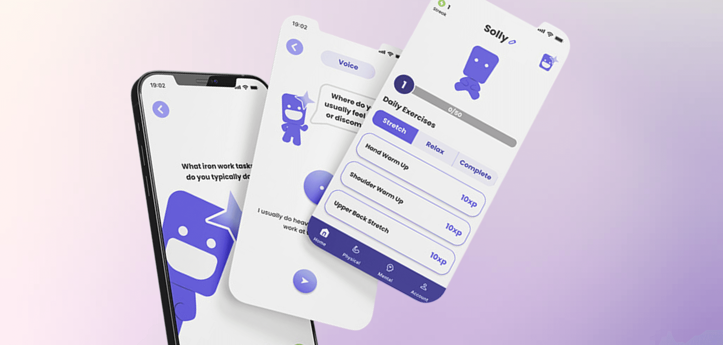
Solace
A recovery app built for the people who never stop working.
Solace is a recovery support app designed to meet people where they are — providing a calm, judgment-free space for daily check-ins, reflection, and progress tracking through moments of difficulty and recovery.
Support without pressure.
People navigating personal recovery often need consistency more than intensity. Solace was designed to be a low-friction daily companion — something you can open in a hard moment and not feel overwhelmed by.
Design for vulnerability.
Recovery is deeply personal and emotionally loaded. Every interaction, tone, color, and piece of copy had to be calibrated for someone who might be in a fragile state. Getting the emotional register wrong could do real harm.
Research-first, feelings-first.
Started with interviews, secondary research, and competitive analysis before any design decisions. The goal was to understand recovery patterns and what made existing apps either helpful or harmful — before defining what Solace should be.
Tested, refined, validated.
Three months of end-to-end design: from research through high-fidelity prototype and usability testing. The final product passed user testing with measurable improvements in task completion and perceived support quality over a competitor app.
Every day, trade workers show up despite the aches, the stress, the exhaustion.
For them, pain isn't a warning— it's just part of the job.
They expect predictable schedules, high motivation, and time to slow down. Trade workers don't have that luxury.
1 /3 construction workers report poor mental health.
These aren't statistics — they're colleagues, friends, neighbors struggling in silence.
This made us ask: what would recovery look like if it truly fit into their world?
When trade workers get injured, recovery takes time they don't have. So they reach for what's fast — painkillers, alcohol, marijuana. Substance use that starts as coping and quietly becomes dependency. Pain that isn't addressed doesn't disappear. It just finds another way out.
Most wellness apps treat body and mind as separate problems. They're built for structured routines and predictable schedules — not for workers who are exhausted, in pain, and already reaching for the easier fix.
The intervention doesn't need to be clinical. A stretch between shifts. A breathing exercise after a long day. Small, consistent moments of care — before pain becomes something harder to manage. Preventing the cycle is easier than breaking it.
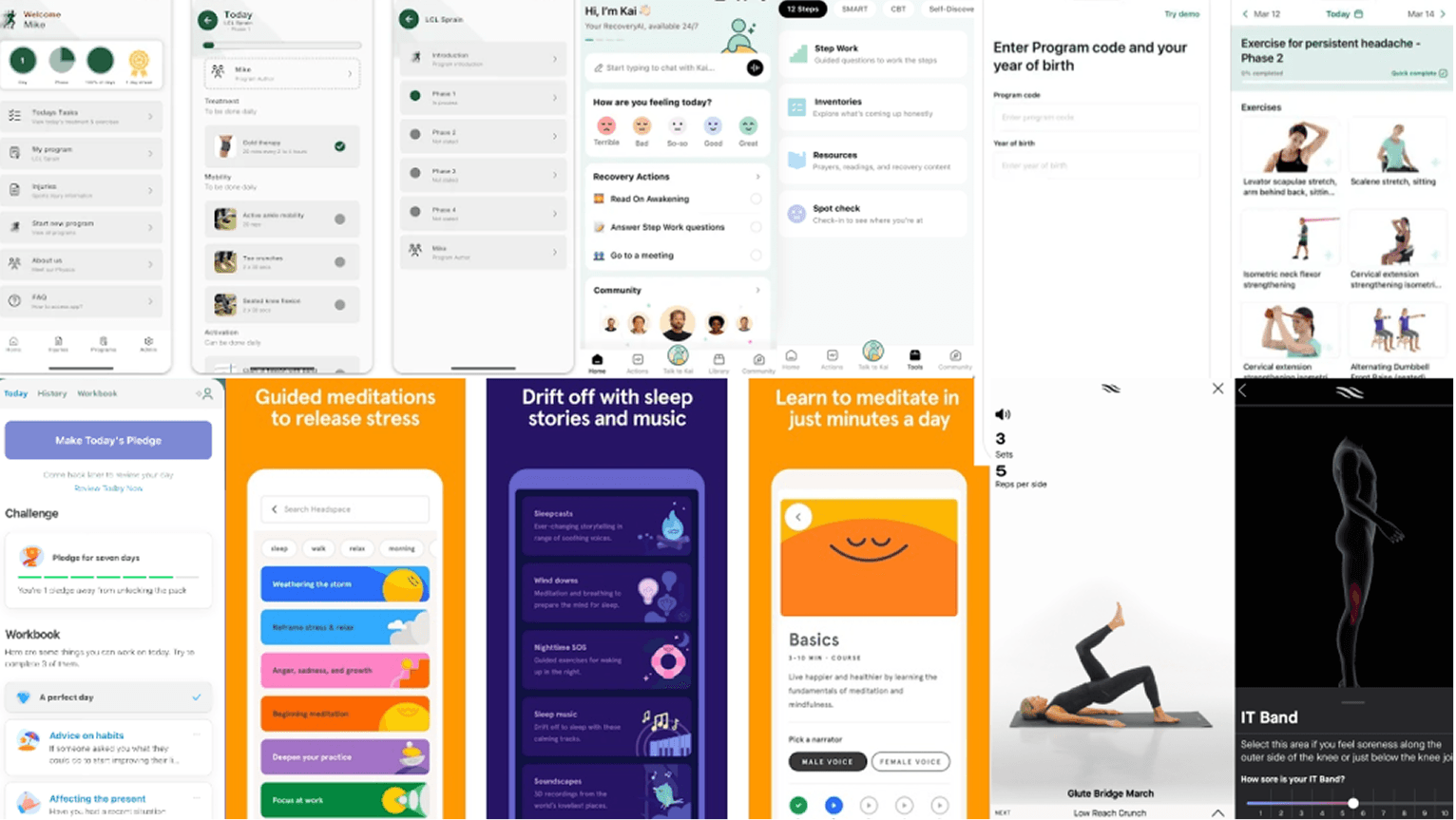
Competitive analysis & user surveys
Review
After reviewing existing wellness apps, the pattern was consistent: too much text, too many steps, and routines designed for people with structured days and predictable energy. None addressed physical and mental recovery together.
Insight
- Apps focused on one dimension — physical or mental, never both
- Onboarding was long and motivation-dependent
- Progress tracking felt abstract and disconnected from real work
- Exercises weren't designed for job-site conditions
The real challenge wasn't building more features.
It was designing for a problem users had learned to ignore.
Consistency matters more than intensity.
Recovery research consistently shows that small, daily touchpoints are more effective than occasional, intense interventions. Solace needed to be easy enough to open every day — not a tool people saved for crisis moments.
Language shapes the experience.
The words used in a recovery app carry enormous weight. 'Track your progress' feels clinical. 'How are you today?' is human. Microcopy decisions became one of the most significant design choices in the product.
Streaks create shame.
Three out of five interview participants mentioned feeling worse after breaking a streak in a wellness app. Any system that highlighted consecutive days needed to be reframed around momentum and return — not unbroken consistency.
People need to feel in control.
When life is difficult, control over small things becomes important. Solace gave users choice over how they check in, what they share, and how their progress is reflected — without prescribing a single right way to recover.
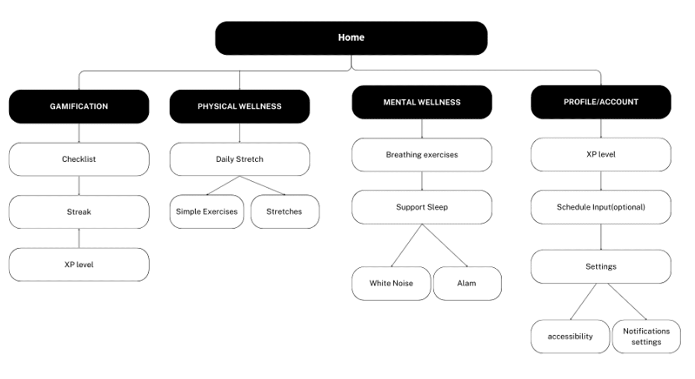
Recovery had to start in seconds, not minutes. The IA was built around reducing decision fatigue from the first screen — short check-ins, simple inputs, no mandatory commitment. If it felt like effort, workers wouldn't start.
Physical pain and mental stress don't exist separately in trade work. The information architecture unified both into a single daily experience — stretching, breathing, white noise — without making it feel like two different products stitched together.
Abstract scores don't motivate. The gamification system was designed so progress felt tangible and personal — tied to real movements, real tasks, and a mascot that visibly grew healthier as users did.
BCCSA guidelines shaped the exercise library — only movements that could realistically be performed on a job site, without equipment, without changing clothes. Research wasn't just context. It was a design constraint.
Information Architecture
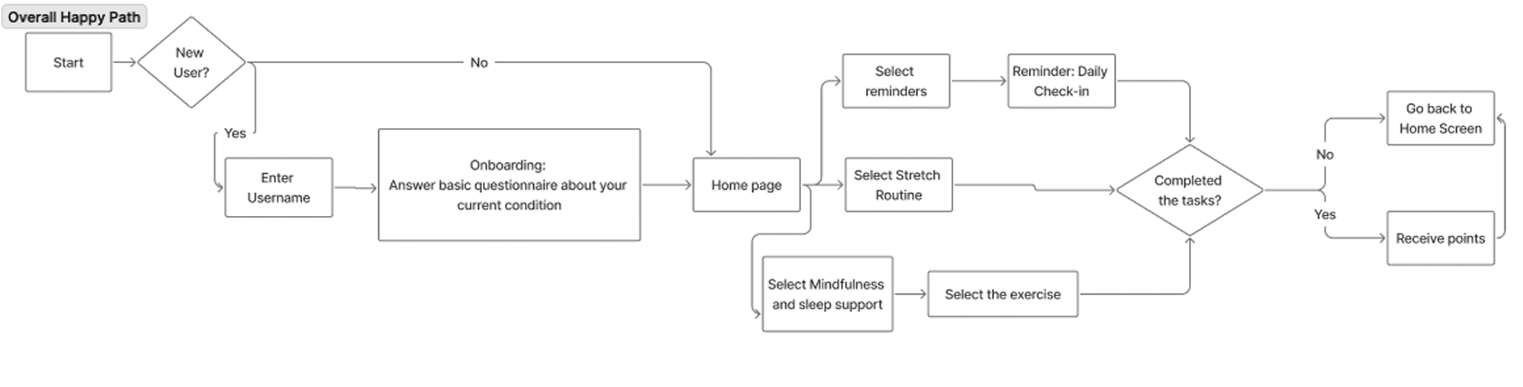
User Happy Path
Tested with real users. Iterated on what didn't work.
Early wireframes focused on validating structure before committing to any visual decisions.
Simple layouts, rough flows, real feedback — the goal was to find where the experience broke down before investing in polish.
Onboarding
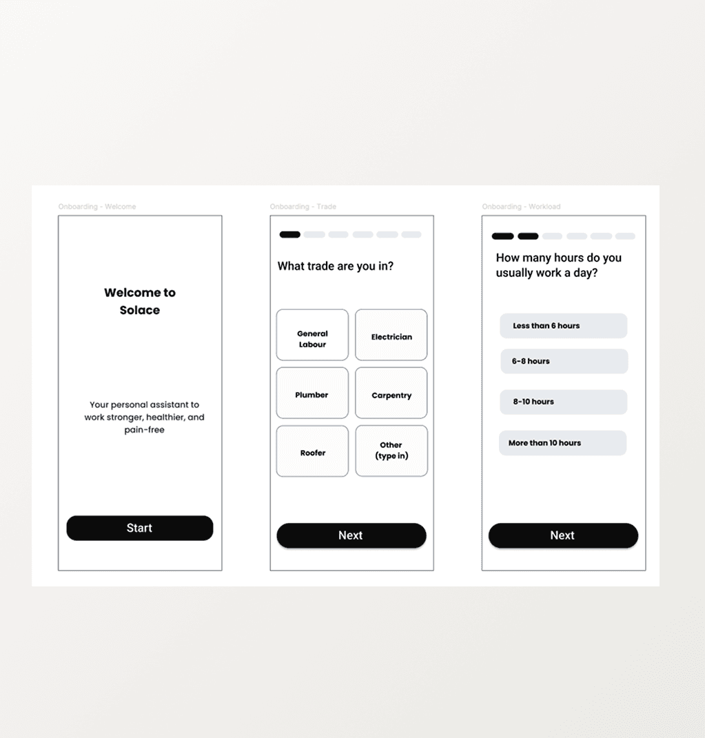
Lo-fi
Simple multi-select flow. Trade type, hours, tasks. Functional, but gave users no sense of what the app was actually for.
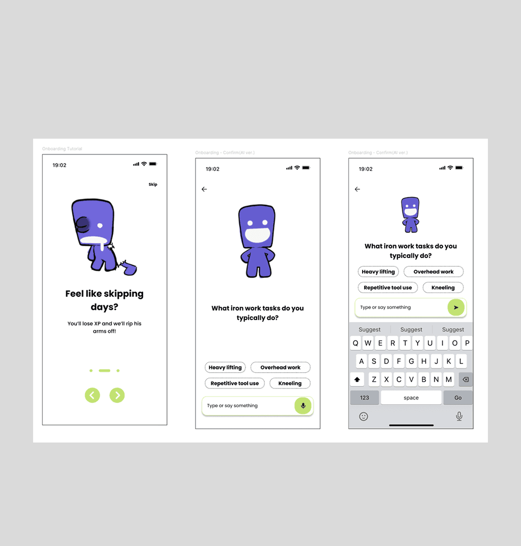
Hi-fi V1
Added a brief tutorial before questions began, with voice input and quick-select cards above a chat interface. The intent was right, but testing revealed users were overwhelmed — too many input methods on one screen, no clear starting point.
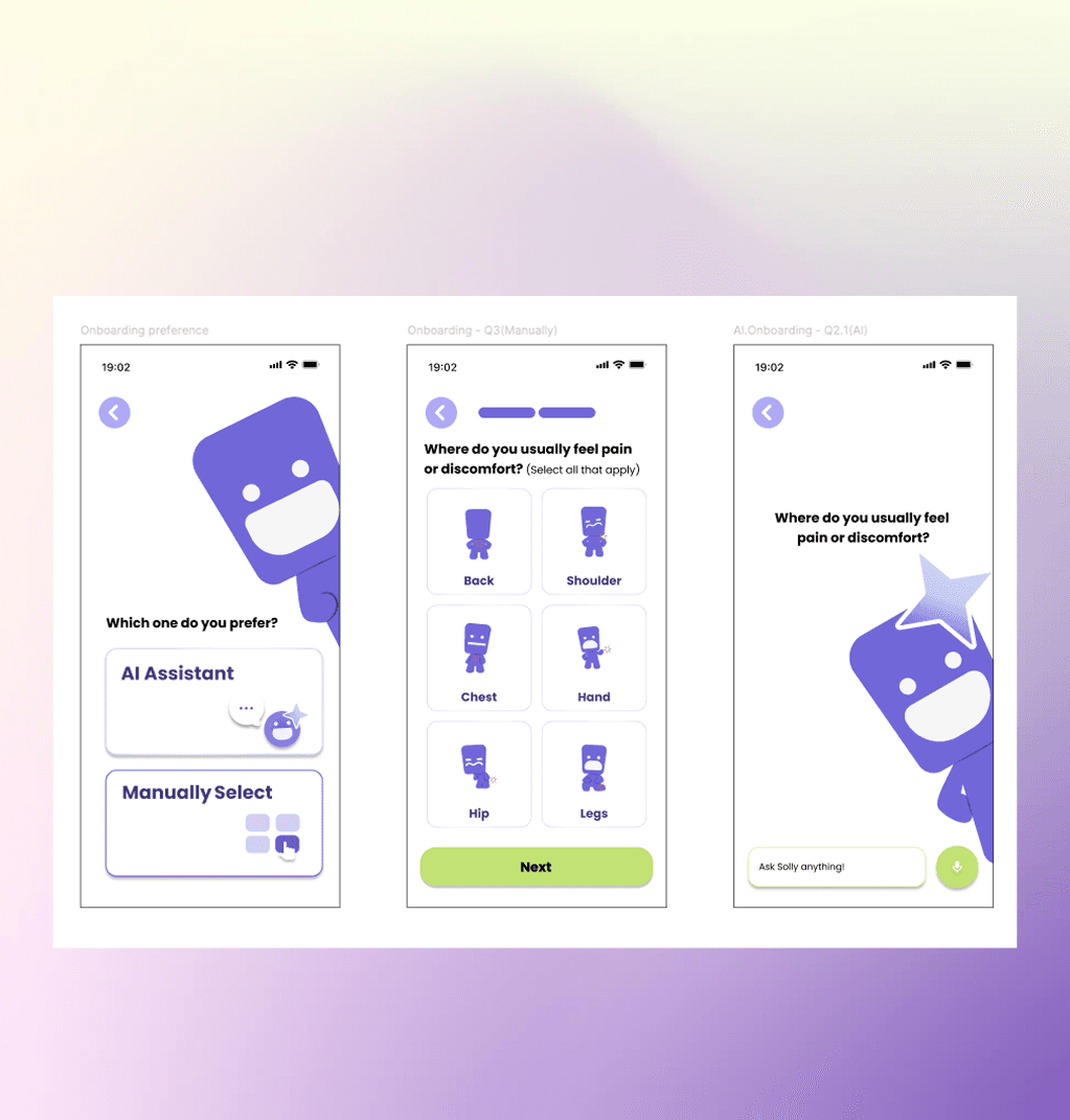
Hi-fi V5
Stripped back to one decision upfront: AI Assistant or Manual Selection. A short tutorial, then a single clear path. Removing competing options solved what adding more guidance couldn't.
Home
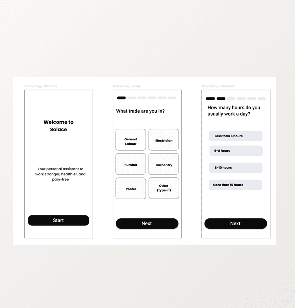
Lo-fi
Gamification and home were separate tabs. Logical in structure, but disconnected in experience.
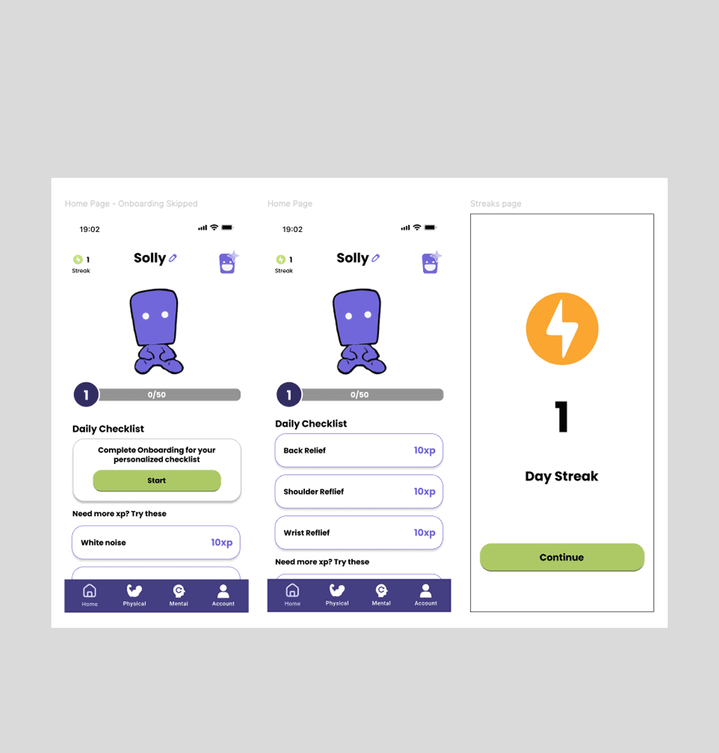
Hi-fi V1
Merged both into one screen. As users completed stretches and mental exercises, XP accumulated and the mascot grew healthier alongside them. Progress and motivation became the same thing.
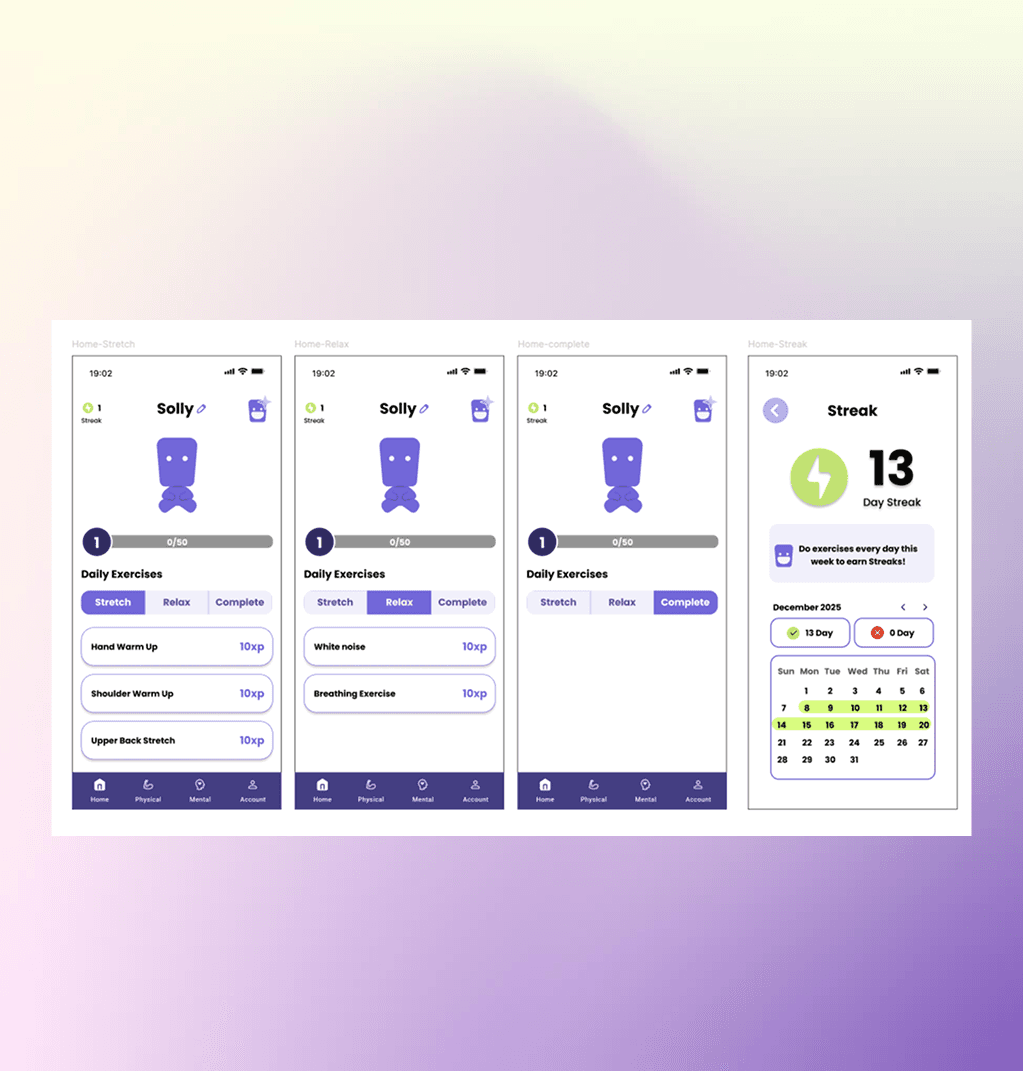
Hi-fi V5
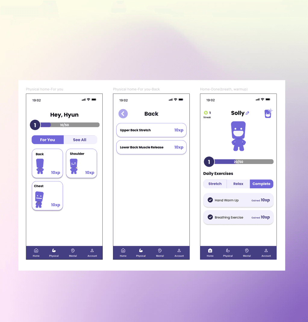
Usability testing showed users were missing tasks that required scrolling. Restructured Daily Exercises into three tabs — Stretch, Relax, Complete — so everything was visible at a glance. The streak tracker evolved from a day count into a calendar view, letting users spot their own patterns over time.
Physical Recovery
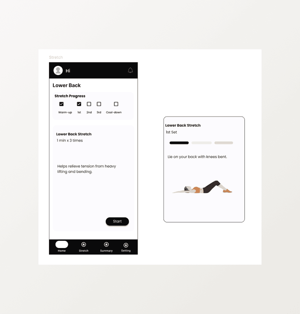
Lo-fi
Gamification and home were separate tabs. Logical in structure, but disconnected in experience.
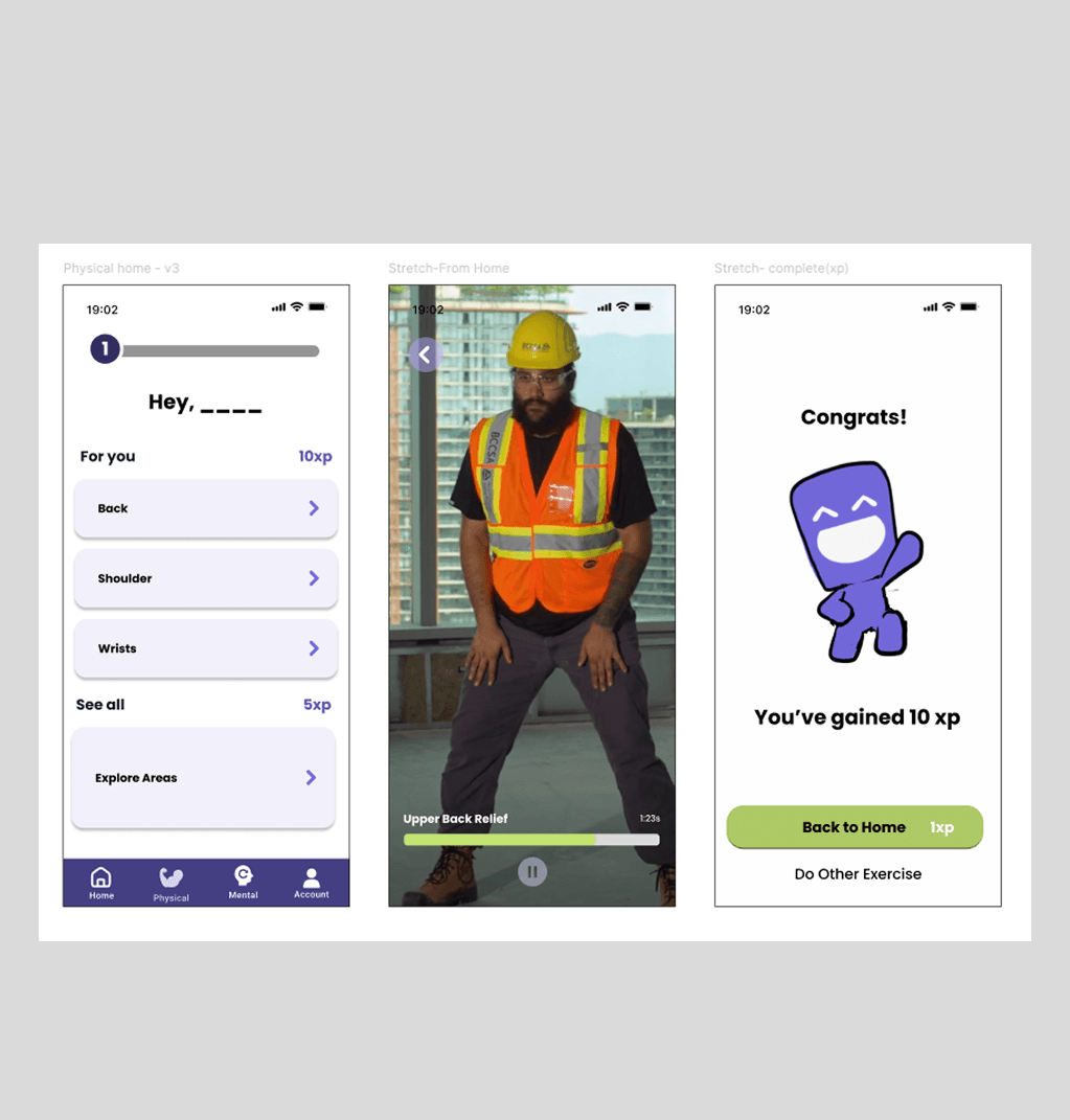
Hi-fi V1
Merged both into one screen. As users completed stretches and mental exercises, XP accumulated and the mascot grew healthier alongside them. Progress and motivation became the same thing.
Hi-fi V5
Usability testing showed users were missing tasks that required scrolling. Restructured Daily Exercises into three tabs — Stretch, Relax, Complete — so everything was visible at a glance. The streak tracker evolved from a day count into a calendar view, letting users spot their own patterns over time.
Video — App Demo
Solace in motion — AI-guided recovery that fits into the hardest workdays.
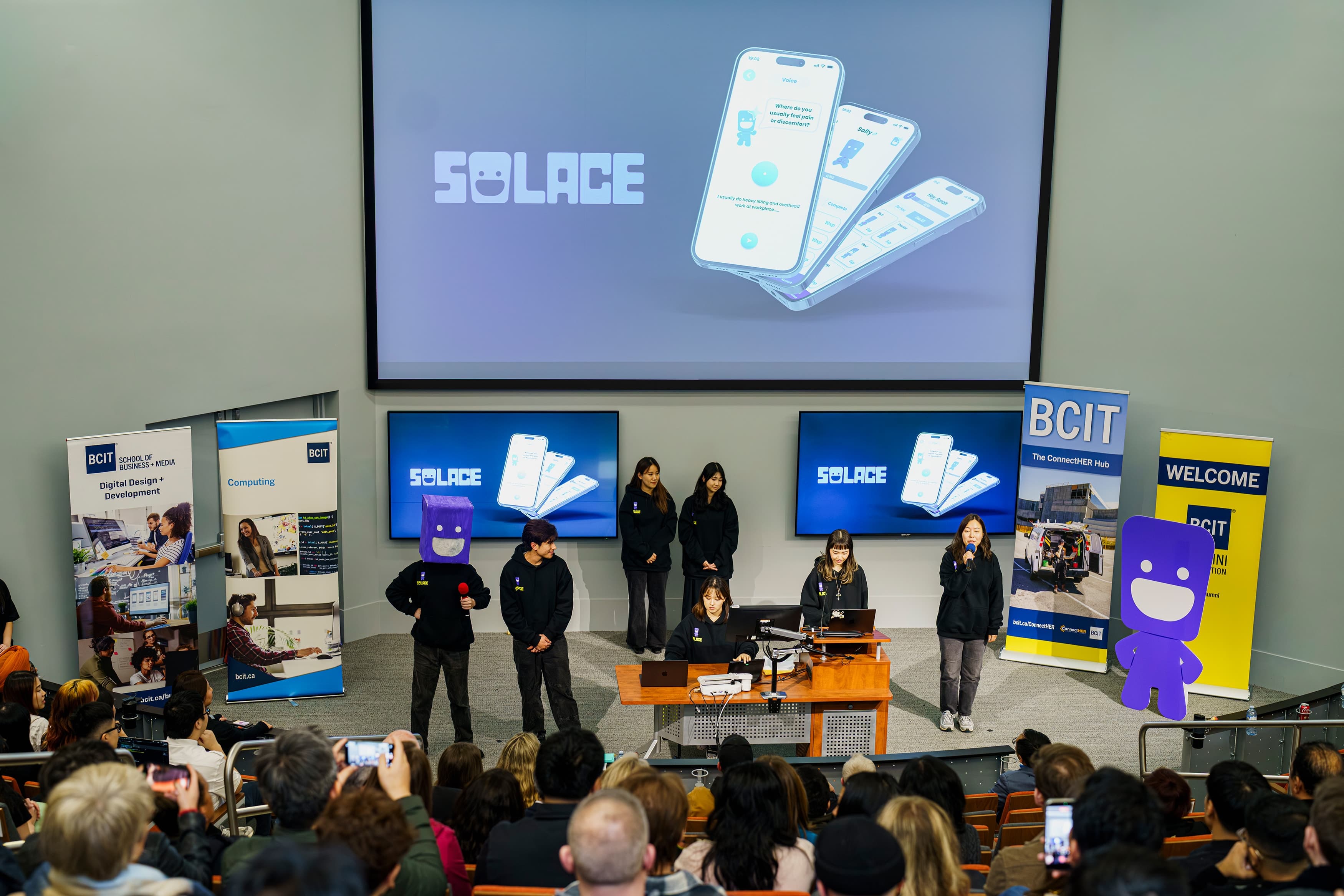
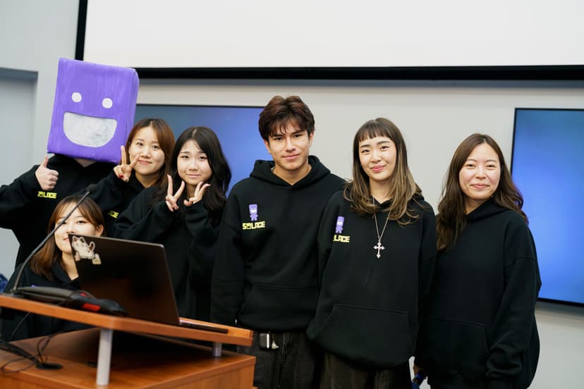
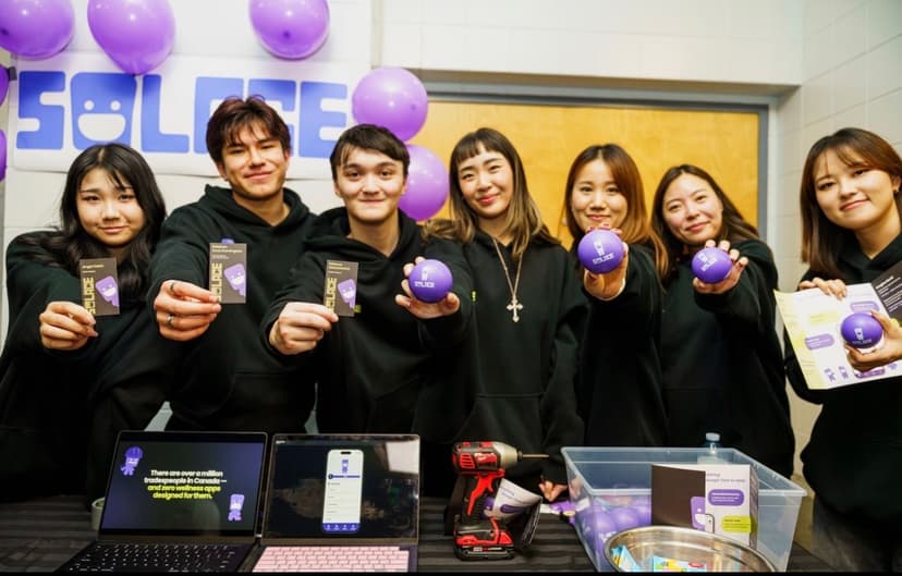
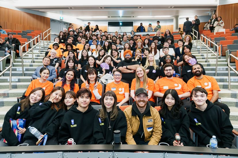
2nd Place BCIT Student Project Showcase
Recognized among student projects for design quality and real-world relevance.
Users responded positively
Routines felt easy to follow. AI guidance felt helpful rather than prescriptive. Recovery felt achievable — not like another obligation.
Proof of concept
The IA, user flows, and component patterns are reusable starting points for every other Eagle OS agent. The work begins here.
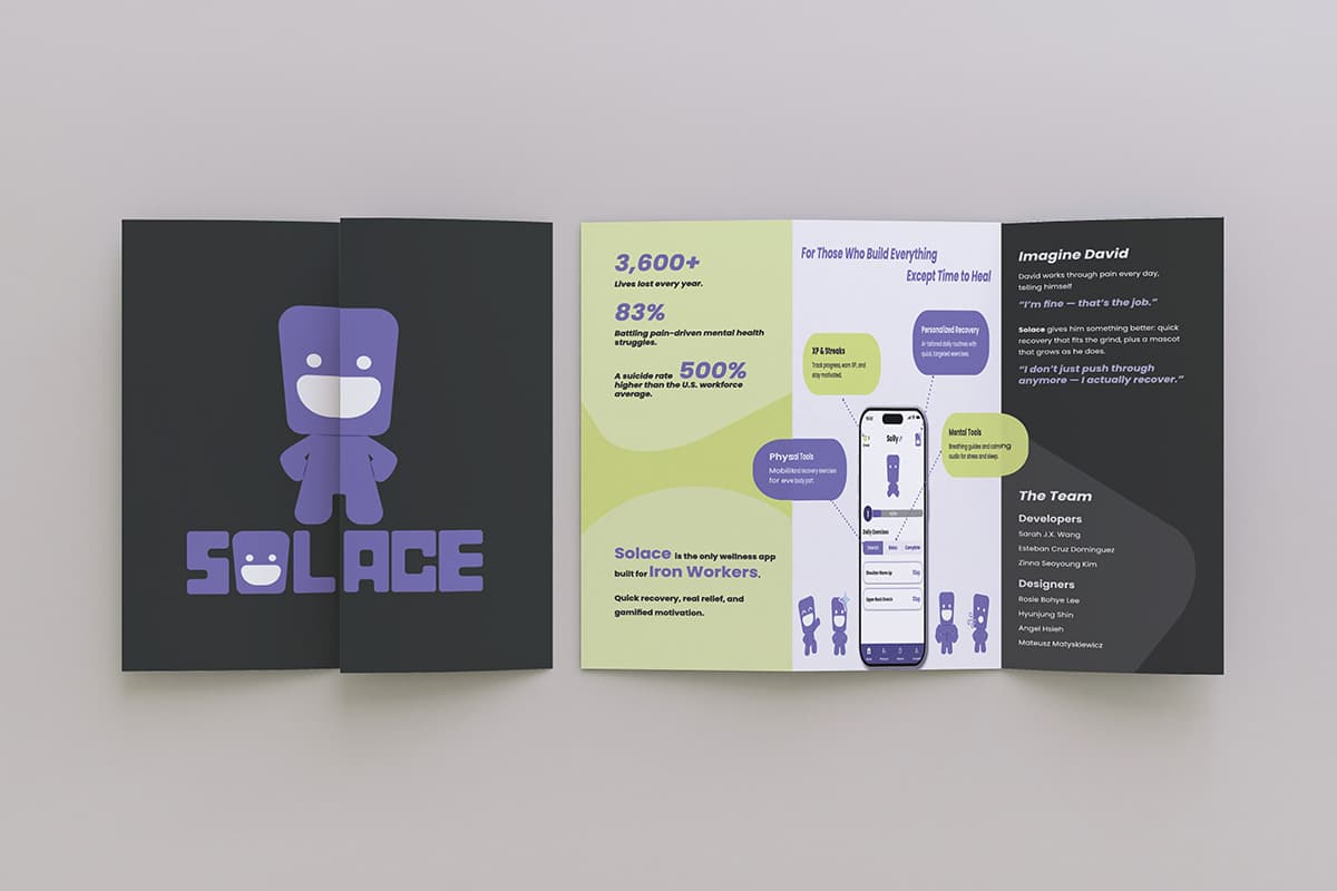
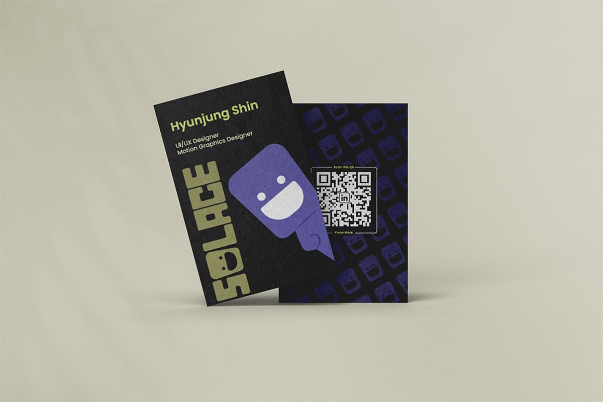
A promotional video created to bring the Solace brand to life — from concept to final cut.
Starting with the emotional context — asking 'how would this feel on a hard day?' — before making any design decision kept the entire process grounded. It stopped me from defaulting to standard UX patterns that would have been wrong for this product. Usability testing with participants who had real recovery experience also produced feedback I couldn't have anticipated or invented.
The visual system came together well, but the illustration direction was defined late in the process. Earlier alignment on visual tone would have made the high-fidelity phase faster and more consistent. I'd also push further on accessibility testing — a product like this needs to work in low-light, high-stress conditions, and that wasn't fully tested.
Designing for emotional sensitivity is fundamentally different from designing for usability. The questions that matter most aren't 'can the user complete the task?' but 'how does the user feel while completing it?' That shift in perspective changed how I approach every product I work on now.